Final Product & Feedback
Final Product & Feedback
The feedback that I received are constructive and helpful. The first question was which one of the drafts is better because I made three drafts of my final product until I found the one that I liked the most, and majority picked advert 1 to be the better one out of the three. I have to disagree because the last draft has a lot a more in terms of title, slogan, client's logo etc. The next question was 'what do you like about the advert?' the answers were mainly about the placing of texts and social media logos and the client's logo, I do agree with these responses because the print adverts got better when I put them on my advert and makes it more eye-catching to potential visitors who might be interested visiting Sunderland. The final question from this forum is 'what changes would you make?' and the responses are mixed, some said to make the bar code smaller, changing the font, and no changes at all; personally I think that my final draft doesn't need to be changed because I'm satisfied with the design that I put it on.


Final Product & Feedback:
The feedback that I have received from my three final products are really positive. The first question was to pick the best one out of three and majority picked advert 1 because the wide angle was great and the italics both in the master heading and sub heading are bold, colourful and distinctively clear which I agree with this feedback. Third and final question was 'what changes would you make?' and the responses are mixed, some said that the slogan needs to be changed and make it less like a tourist advertisement or positioning of the text in the middle and move it to the bottom, while one said to make the bar code smaller as its too big and distracts the viewer; I have to disagree on the bar code one because I think the size is okay and not big in my opinion.
The final products fit the brief and client's standards because I have included all the things that would make the print advert really successful like the main image to attract audience, perfect title to eye-catch audience to the advert and social media details so the audience can learn a bit more about the client on what they do etc. I put the slogan 'Enjoy The Experience!' in different colours to attract more audience and making each advert unique, and also because to blend in to each image.


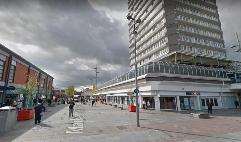
These are the pictures that did not make it. The first one is Mowbray Park and as you can see, the trees are in the way of the glass building and the lake and all what you get is a electronic box right in front of you. If this picture made it to the final product, the audience would probably not find the print advert less interesting and dull to the eye due to the lack of anything going on in the picture and that's why decided to go a lot closer to the lake to capture both the lake and the glass building so the advert can be interesting and eye-catching to the audience. Next one is the old clock in down town near Primark, the mise-en-scene in this picture looks sad and depressing due to being cloudy in that day and really doesn't make a good main picture as the client wants to introduce Sunderland in a positive light and they wouldn't want the main image to have that's has gray clouds where the sun and blue sky is no where to be see, so I took the same picture but this time it was sunny and a beautiful day but I also decided to do differently than the previous picture by taking a photo of the old clock in slightly in its sides so I can capture the road that leads to the cinema. The final picture is the shopping centre called Bridges, I want capture an image of the entrance with people coming in and out of the shopping centre, but as you can see that the pictures doesn't have any of it which makes Sunderland look like pretty dull and empty place but the camera angle is good but it needs that final improvement which is the people as I want to show the audience that Sunderland is interesting and busy place.

Comments
Post a Comment